How to Create Charts and Dashboards for MongoDB
Learn how to turn raw MongoDB data into charts and dashboards using a MongoDB GUI. Filter data visually, build aggregations, and create clearer reports faster.


When you open a MongoDB collection, the data is all there, but that does not always mean it is easy to understand.
You may have nested fields, many documents, different values, and too much information to scan manually. A raw collection can work as a storage view, but not always as a decision-making view.
That is where a visual MongoDB graphical user interface like VisuaLeaf becomes useful.
Instead of going through each document individually, you may transform your collection data into a chart, filter the information using a visual query builder, construct an aggregation, and combine everything on one dashboard.
In this tutorial, I will walk you through the process, from your collection data to your final dashboard, in just four steps.
If you prefer a visual explanation, you can also watch the full video below.
Begin with a MongoDB Collection
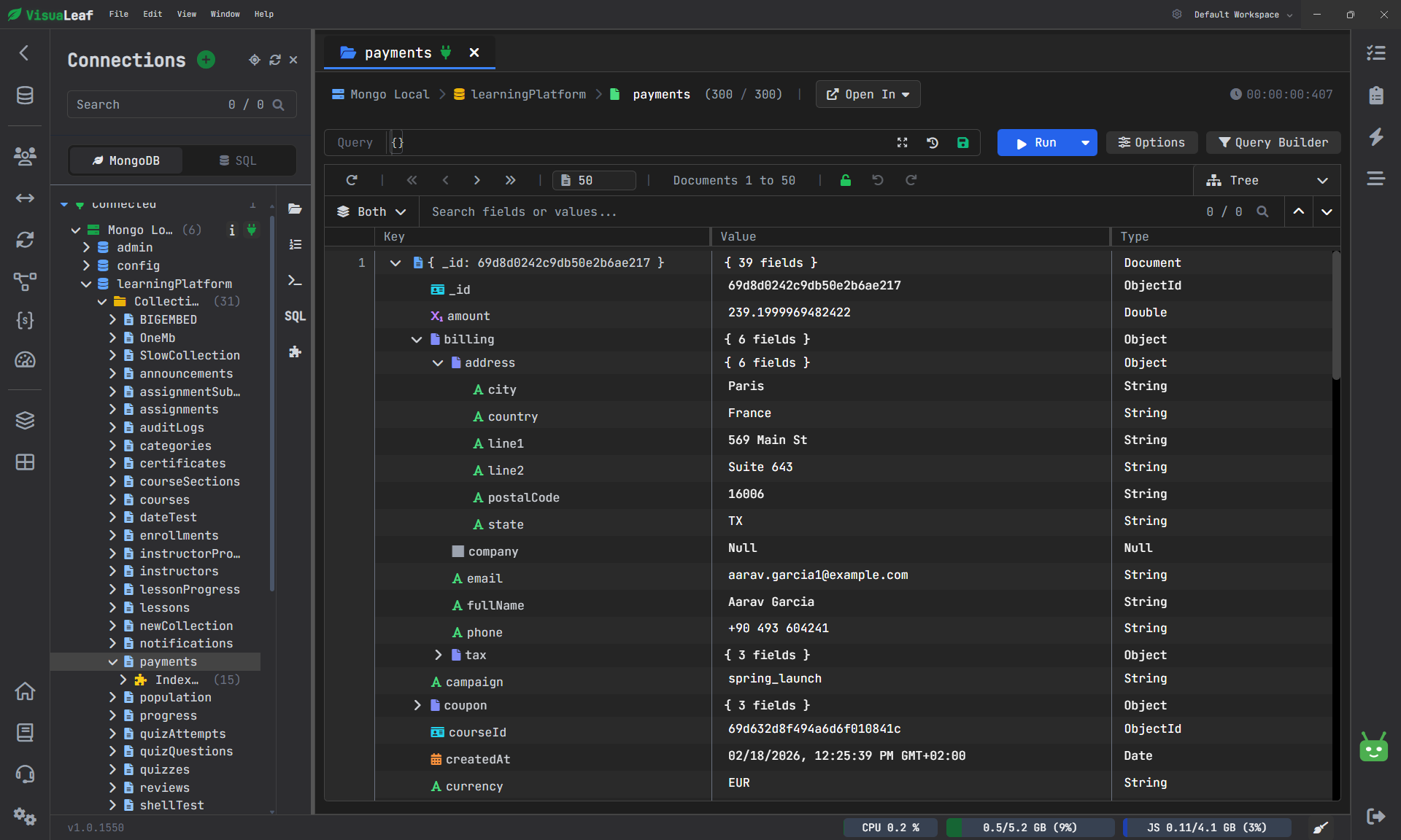
You can directly start from a MongoDB collection and make a chart based on it without exporting to other tools.
For instance, there could be a payments collection with plenty of documents with multiple fields, including dates. To understand the picture of what's happening in such a collection, one needs time, and even then, it is not easy to see the big picture.
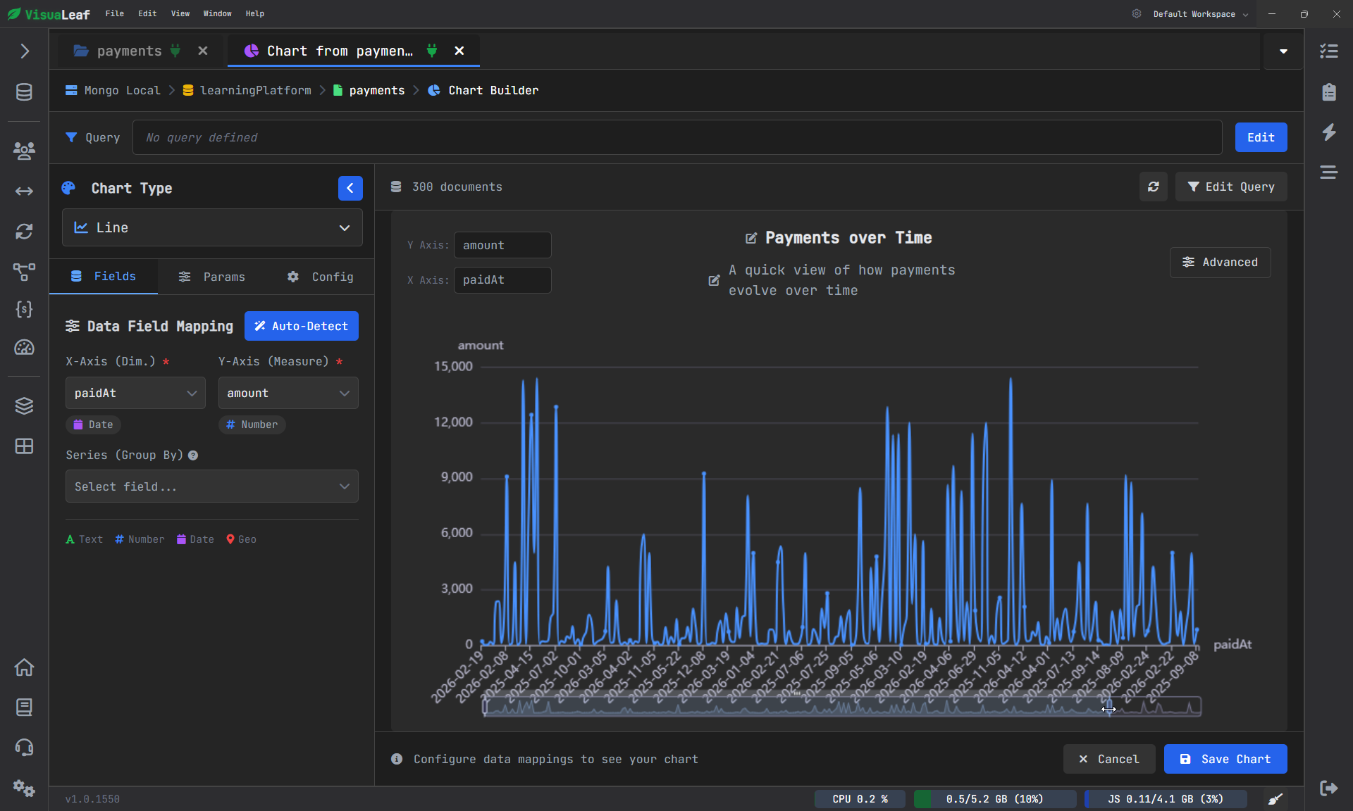
Alternatively, you can open the collection in Charts, create a chart, and add a line chart.
Next, you need to pick out:
- The datetime of the payment field
- the payment amount field
In just a few seconds, the collection transforms into a chart reflecting the dynamics of payments.
It is not always easy to understand what is going on in terms of JSON or table rows. A chart might be an option here. This is another reason why a MongoDB viewer with chart the support may be a more practical solution than regular document browsers.
You may also rename the chart to something like Payments Over Time and save it for future use.
Now that the chart is ready, it can actually be used, as it provides you with an immediate idea of how the values change.
Raw Data Is Not Always the Data You Need
The first chart has been built directly based on the raw collection.
Of course, this helps get an immediate understanding, but in practice, it is very rare to need all the data at once. In most cases, what you need is exactly the hat part of the information, which will help you to find the answers.
It is when visual queries for MongoDB come into play.
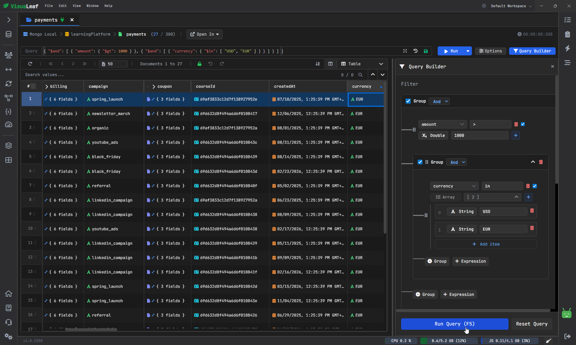
Rather than typing the code yourself, you can transition to Query Builder and create your filter visually.
So you can:
- select only transactions over 1000
- apply filters for currencies like USD and EUR
Now the result becomes more meaningful to analyze.
You are not looking through the whole data anymore, but rather at a subset of the information you need.
When you are done with filtering, you can proceed to the Chart view.
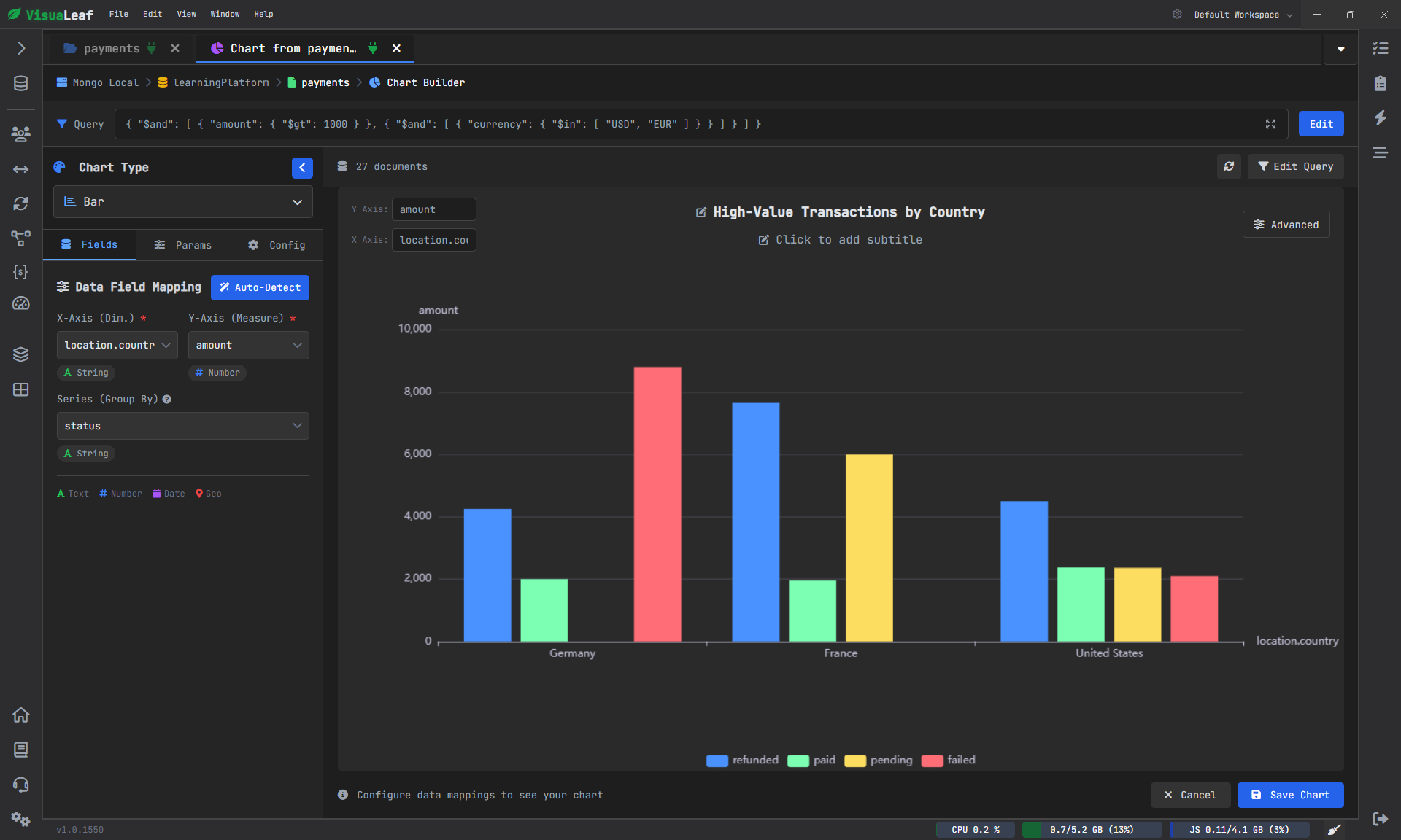
In this case, a bar chart would do perfectly well as you could easily:
- group data by countries
- set the amount as the value field
- set the status as the breakdown
As you see, there is already something to think about here.
Go Beyond Data Visualization with Aggregation
Data charts from filtered collections can be helpful, but there are times when filtering alone is not enough.
There are cases where calculation is needed.
That is why aggregation plays its role in the data from raw to insightful information.
With a visual pipeline for building aggregations, you can simply drag and drop the needed stages, and you will immediately see how the output changes.
For instance, you can use the following stages:
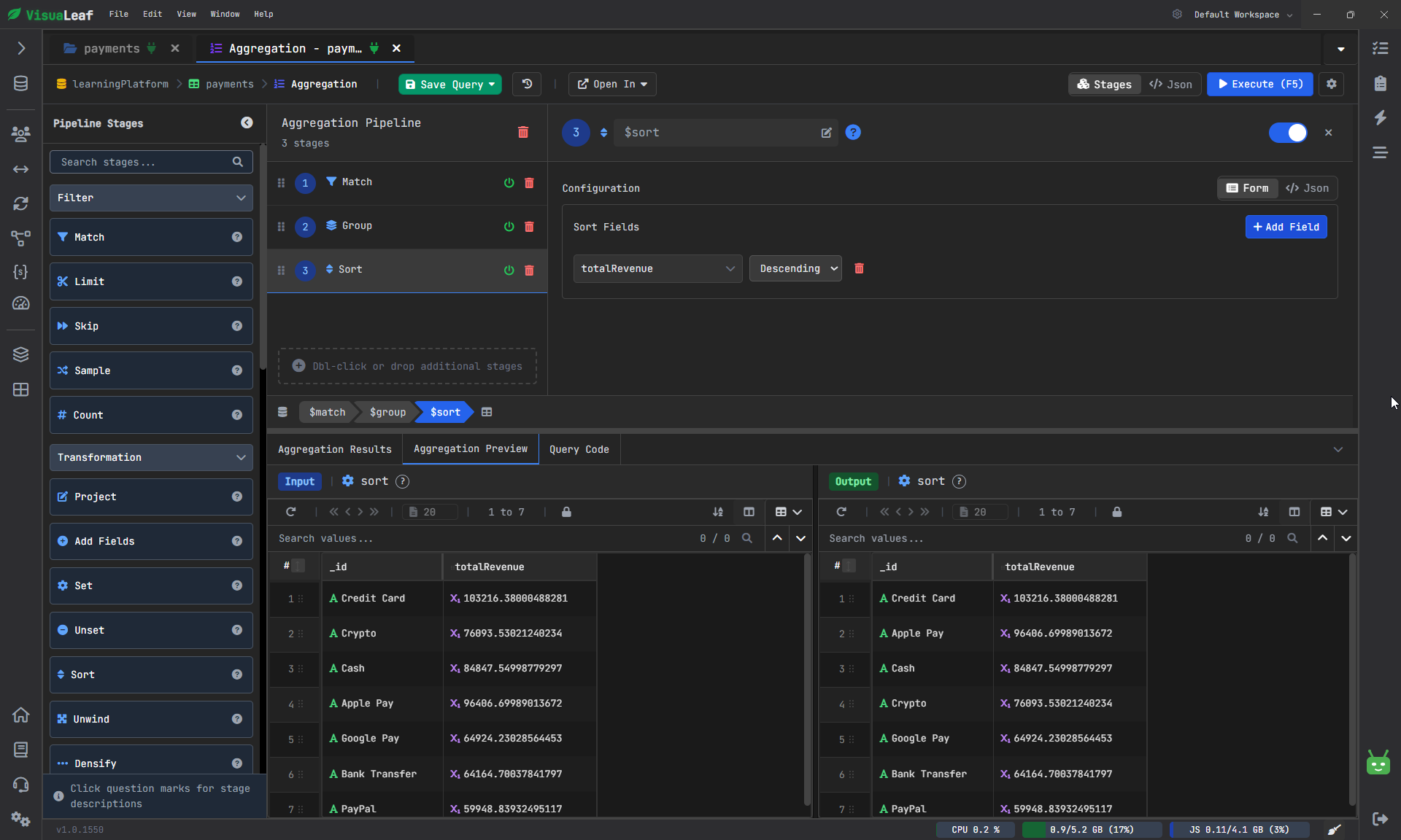
1. Match
Select only those transactions that have a transaction value greater than 500.
2. Group
Group all the documents according to their payment type and compute the total income by adding up the amounts.
3. Sort
Sort the output in descending order by total income.
Now the output data is different from the previously filtered collection.
Because the output data now represents the result of your aggregation, which answers the question:
What are the payment methods that bring in the most revenue?
In such cases, it makes sense to opt for a visual tool.
Create a Chart Based on Aggregation Output
The aggregation step is now complete; the result can be opened in Charts.
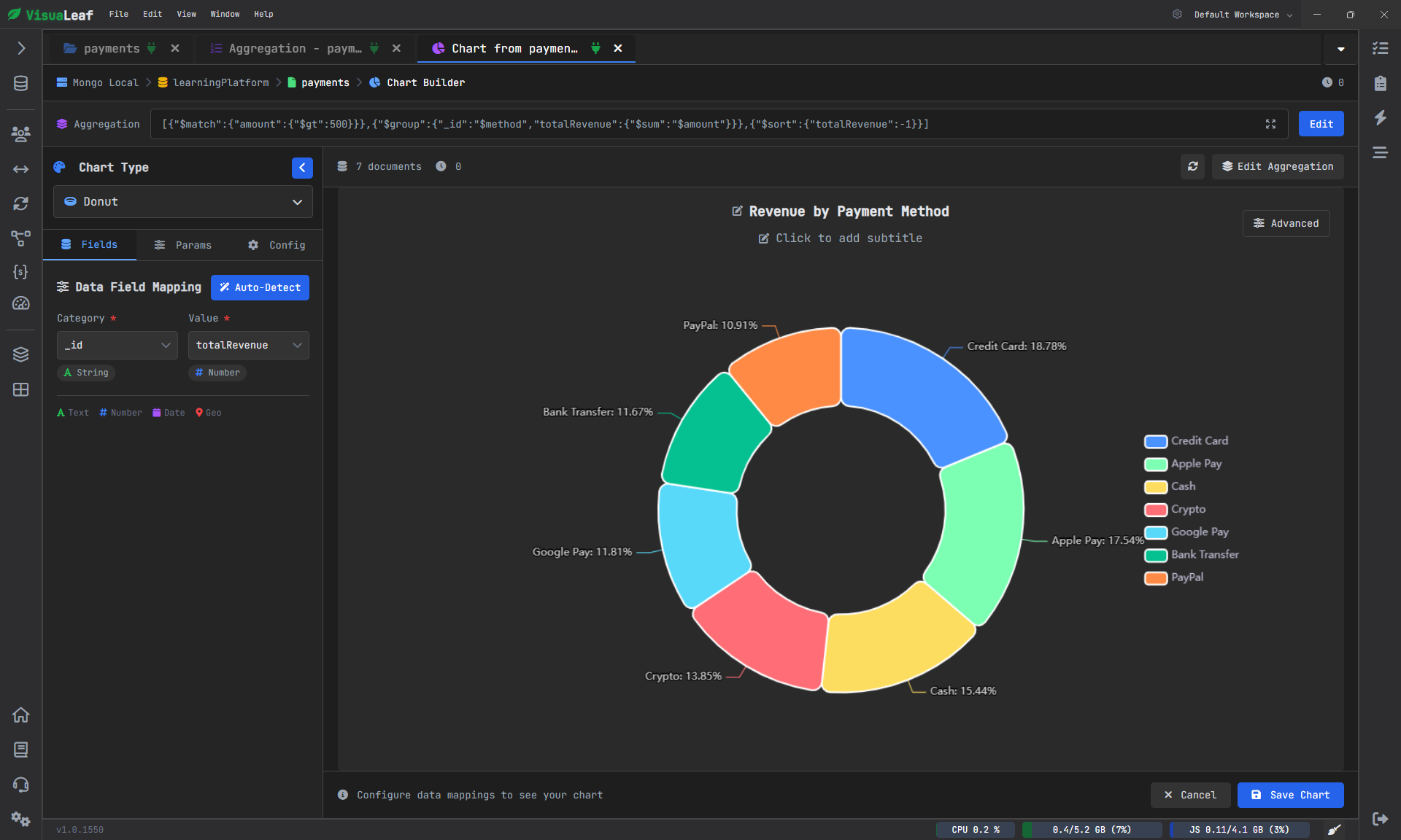
If chart detection works for this dataset, it will automatically create the chart based on its output structure. A pie chart would be an excellent choice here as it highlights the distribution of revenue across the different payment types.
As you can see, the information is now easier to understand.
It’s no longer necessary to review the aggregated results and compare each line against others manually. The source of maximum income is apparent at first glance.
This is one of the many benefits of integrating MongoDB queries, aggregations, and charts into one workspace.
Combine Everything on One Dashboard
A single chart is useful.
But the dashboard offers the whole story.
When you have already built charts using:
- a raw collection
- a filtered query
- an aggregation pipeline
Then you can combine them into a single dashboard.
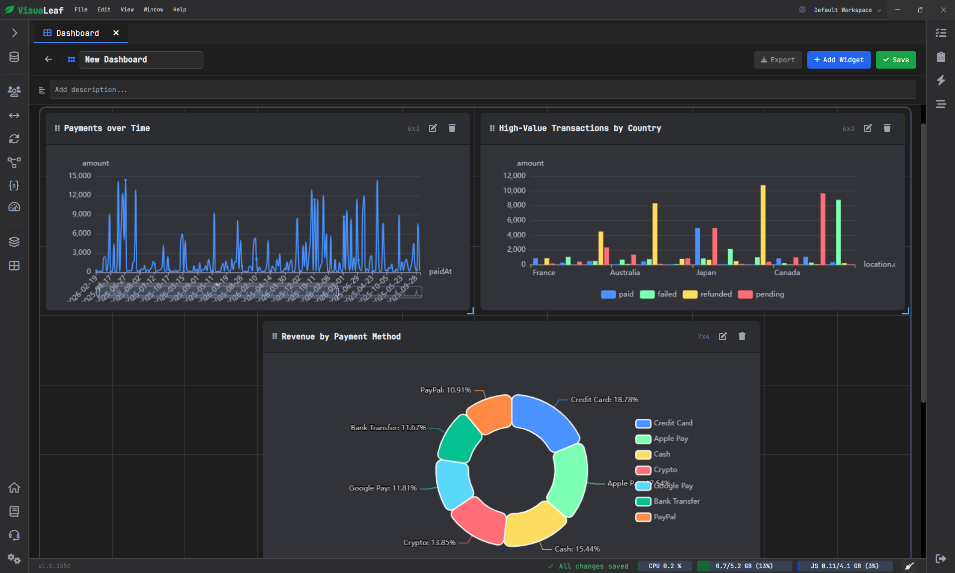
It means that you are no longer analyzing individual parts of the information.
Instead, you gain a holistic understanding of the data as a whole.
This approach is much more similar to what a team would actually do when they:
- analyze trends
- compare values
- evaluate the results rapidly
- discuss them internally
Moreover, as long as the chart remains linked to the underlying query or aggregation, you can still modify its structure if needed.
In other words, the dashboard stops being a passive report and turns into an interactive database view.
The Importance of MongoDB Visualization for Documentation
Most companies view MongoDB documentation as only about schemas or fields.
However, documenting does not always have to mean annotating your data.
Graphical representation of any kind provides documentation of what is going on in the database in an entirely visual form. Graphs allow identifying trends, making comparisons, analyzing distributions, as well as showing business insights and tendencies that cannot be conveyed through documents alone.
Therefore, if you create graphs and dashboards using any type of MongoDB viewer or MongoDB GUI, you do more than just explore your data. You also create an additional level of documentation.
Conclusion
The data stored in a MongoDB database is invaluable. However, it does not always make sense.
A collection might have all the information you need, but in a format that you cannot decipher easily.
Using a collection to create visual MongoDB queries, aggregating your findings, and designing a dashboard with different charts allows you to convert raw information into more meaningful content.
It eliminates any guesswork about your data.
Now, you can clearly visualize your findings.
For those who wish to test out this process themselves, it is possible by using the VisuaLeaf platform to discover the benefits of a data visualization tool for managing charts, queries, dashboards, and more informative MongoDB documentation.